Sunday, 5 August 2012
Wednesday, 6 June 2012
PPD - Final Presentation
Below is my finished PDF for todays presentations, I've tried to be as minimal as possible, purely because I feel that the relevant imagery will be enough for me to expand on rather than confusing people with information on screen.

Thursday, 31 May 2012
PPD - Final Website
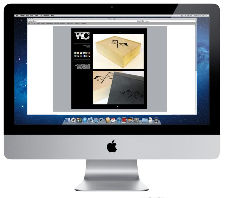
Below are some mock ups of how I want my final website to appear. I decided to stick with the grey black and white colour scheme for the time being giving me a chance in the future to come back and add a bit more colour, I think once I have it uploaded and ready to go on a domain name and have my hosting sorted I'll start to finally tweak areas of the coding in relation to design.
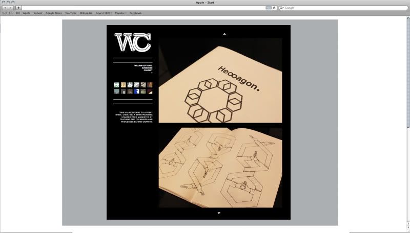
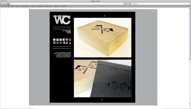
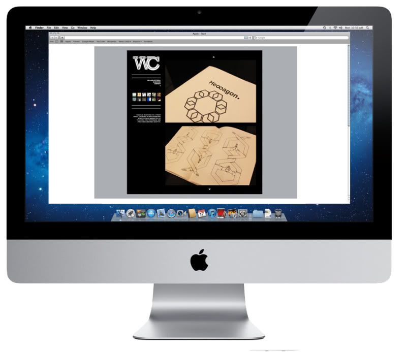
Mocked up on screen, I have considered how the restrictions of working to 1600x800 can change aspect ratio's of images and content when using a different device other to a computer. The format of my website will have to be touched up a little because I can imagine they're will be difficulty when viewing it on a tablet or phone.
Sunday, 27 May 2012
PPD - Website development
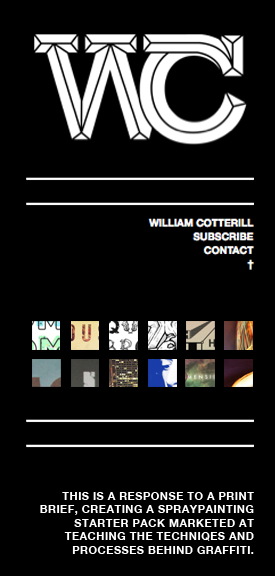
So far I've produced a series of different scamps and being playing around with different visual outcomes for my personal branding. From the sessions with Simon and Lorraine and some help from books in the library I've gained a basic knowledge in HTML and CSS, below I've started to put together a basic idea for my website, sticking to the same theme as my blog and tumblr so they are all consistent.

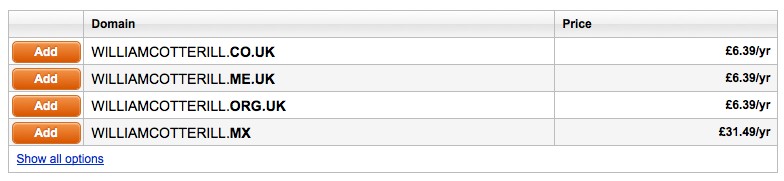
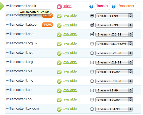
The username williamcotterill.co.uk has been taken already by an artist in Oxford who shares the same name as me, coincidentally I think his website is very visually appealing, simplistic, and works very well for a horizontal scroll. However as that was my ideal web address I'll have to search for another. Below are a few quotes I've got for different usernames so far...
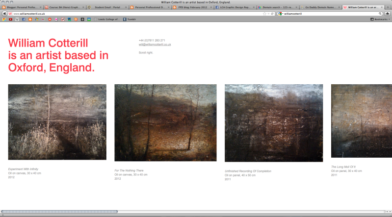
The username williamcotterill.co.uk has been taken already by an artist in Oxford who shares the same name as me, coincidentally I think his website is very visually appealing, simplistic, and works very well for a horizontal scroll. However as that was my ideal web address I'll have to search for another. Below are a few quotes I've got for different usernames so far...
A few different colourways....
Even though I want to keep as consistent as possible to my tumblr and blogger, Experimenting with colour has been really productive in generating more ideas for my website. I Think it would be nice to have the same layout for each one of my networking options but each one to have a different colour theme/gradient.
I tried to keep the links and buttons as user friendly as possible and easy to understand, on the right hand side my content will be displayed and on the left links to subscribe and contact + a small blurb about the work you're viewing. I thought the grid of small thumbnails immediately communicates that they have some sort of function so no need for an explanation cluttering up the rest of the page.

I felt as if there was no need for a scroll or a bar either side of the page but instead just two small arrows that could be easily recognizable as moveable buttons. The content displayed on the right hand side of the page will be navigated by simply clicking the small arrowhead at the top of the page or the small arrowhead at the bottom.
When a new project/brief is selected from the archive of thumbnails on the right hand side the content below underneath the separator will change accordingly to the content displayed on the right hand side of the page.
PPD- Final Buisness Cards + Mailout
Below I have Printed my business cards and letter heads, I chose to use a
thick white card stock for the buisness cards, but when printed
professionally they will logo on the front will be black spot varnish on
120gsm.


Below are a couple of quotes I've been looking into so far regarding the printing of my business cards. If I decide not to print them with a company and do them myself I think they would be ideal to screen print.
http://uk.moo.com/


PPD - Web Presence Tumblr
Networking and getting involved in online creative clusters is going to be a major part of my professional development as a designer. At this stage I want to focus on the building of my own personal web address but also have parallel links to other locations Online where I'm getting my work out there. When I was 14 I decided to make a tumblr, the screenshot is below ( You can tell how old I was because of the poor design haha!) Tumblr is a perfect location to start reaching the sorts of contacts I want to come across in my design career. Its full of creative people from all different backgrounds and is really focused on artistic interests. I've been re-vamping the html for my Tumblr for quite a while, below is what I've come to produce, the only final thing I need to code is infinite scrolling.
http://williamcotterill.tumblr.com/
5 years ago...
http://williamcotterill.tumblr.com/
5 years ago...
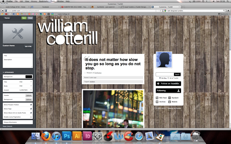
Revamp...


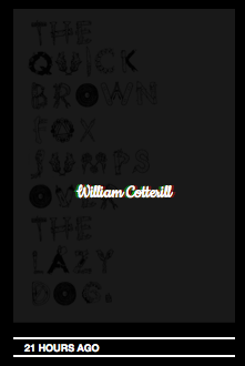
Understanding the tumblr style sheets was my first issue, I used some sourced code of the internet to help to to set up my page. One of the features used is a rollover so that when hovering over an image it fades into the background, in the foreground my name becomes the click able item.
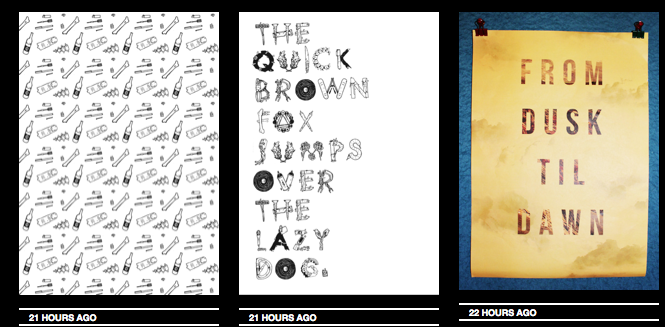
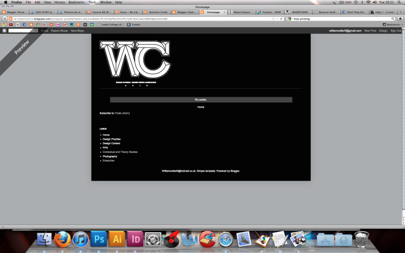
The black grey and white is going to be an ongoing colour scheme across my personal branding, from my google blogger to my website. Below is a few images of my blogger with the same consistent branding;
Saturday, 26 May 2012
PPD - Making Your Mark Letterhead
So far I think I've come up with some consistent branding for my personal and professional work that communicates both me as a designer and as an individual creative. Below are a range of deliverablea I've formatted my logo to. The main one being a letter head Ideal for sending out to clients/agencies when doing Live briefs or contacting someone in regards to work.