Thursday, 30 August 2012

Summer Devlopment: Digital and Hand drawn Illustration

Hand Rendered Illustration/Painting

Over summer I spent alot of time on the move and didn't always have access to work digitally, which I really liked, being away from the computer gave me a chance to produce some of the more personal work I've been thinking about all year, Drawing things I've wanted to draw for a long time and experimenting with media I've always wanted to practice with. This is not just one of my aims and ambitions for third year but something I think I would like to continue for the majority of my life, but a page in a sketchbook a day is a really good creative release of ideas for myself, with the ability to easily notice progression from page to page. I think this task is easily achievable and something I want to consistently be doing. One of my other aims and ambitions for third year is to be really experimental in my choice of deliverable, thinking and outside of the box when it comes to final outcomes and working with unusual surfaces as a form of communication. As an example, over the summer I tried painting on the blades of some knives (I'm not a psychopath I swear) This is just another example of some of the hand rendered personal creative projects I've been up to over the break even if they are a little strange. As you can see in the Photo Below I also completed a painting on a piece of wood, using masking tape sandpaper and spray paint, looking at Aztec patterns and contrasting colour palettes, Although a little 'fine-arty' this has definitely given me a starting point for ideas working with patterns digitally.


Digital Illustration/Drawing

This Summer, I was lucky enough to receive a Graphic Tablet for my Birthday. Last year I used a Basic Medion standard drawing pad but upgrading to the bamboo has been fantastic, It's opened up my eyes to drawing digitally in comparison to some of the stuff I was producing Last year. I really feel I've started to grasp a significant style and approach in my illustrations, using quite rough sketchy lines and areas of pointillism. I was inspired by Vice Magazines Dog show video and produced the drawings below, playing around with quite psychedelic and unusual subject matter.

Wednesday, 22 August 2012

Bramhope Primary School Mural

During the break over summer, I practiced my can control and spray painting techniques by taking part in a collaborative Mural. Me and a friend from Art and Design Interdisciplinary have a friend who's parents work closely with Bramhope Primary School just outside of Leeds. Unfortunelty the side of their building was defaced with some tags and they wanted someone to Cover the area, I thought this would be an ideal project to keep myself productive in terms of being creative and working with a deliverable other to print and web

I tried to treat this opportunity alike to that of a live brief, thinking about my audience context, content and time-frame.

Below are a few of our initial brainstormed Ideas and considerations and a few sketches to start to get subject matter flowing. Our main concern is our audience, being Primary school children so subject matter is going to need to be appropriate for their age group. We want to use some themes that the children can relate to, they have a conservation area and small allotment so fruit and vegetables, plants tree's and nature is going to be our first port of call.


The space we've been given to work with is a rather awkward area and stretches around a corner, also there a drainpipe that sits in the corner of the two walls so this is going to be a big consideration, we want the painting to interact with its surrounding environment so we're thinking incorporating the drainpipe could be very interesting.

So far our plans are to create a series of rolling hills, using the drainpipe as the basis for a tree trunk, then separating out each wall with a fading light to dark sky. Ideas for characters so far are Owl's, Birds and Bee's intertwined with foliage and vegetables in the foreground.

Our budget on Paint was something that would also have to be very well planned as certain shades would be used more than another and certain colours we would need more of. I got a selection of different greens as they would be heavily used in the foreground mixing brands of paint to try and get a really unique palette.


We started by brushing off all the dry brick and cobwebs from the wall then using multiple coats of paint we created a thick layer of white to work on top of.


Work In progress

Below is a series of photographs of the wall at different stages. We estimated to complete the painting over a frame of 5-6 days but due to typical British weather conditions it took us a little Longer, but after 10 days we were able to walk away satisfied.


 Final ResultI was really happy to the conclusion we came to with our mural even thought If I did it again there would be a few things I'd change, in terms of layout etc, But i guess that's just me trying to be a perfectionist. In September when the children start back at the Primary School we hope to go and do some mini interviews to see what they think of the work. I think this will provide a really neutral and naive point of view, especially from children of such a young age. 


Sunday, 5 August 2012

Start Of 3RD Year

Start Of 3RD Year

Wednesday, 6 June 2012

PPD - Final Presentation

Below is my finished PDF for todays presentations, I've tried to be as minimal as possible, purely because I feel that the relevant imagery will be enough for me to expand on rather than confusing people with information on screen. 


Thursday, 31 May 2012

PPD - Final Website

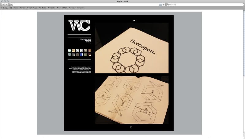
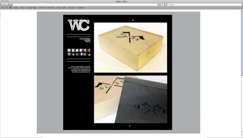
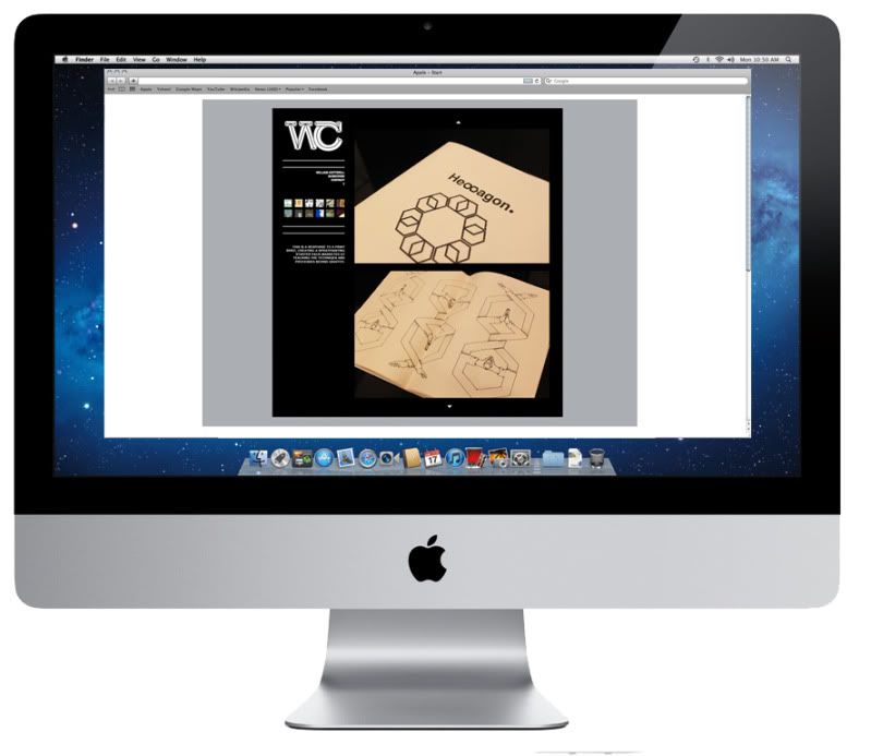
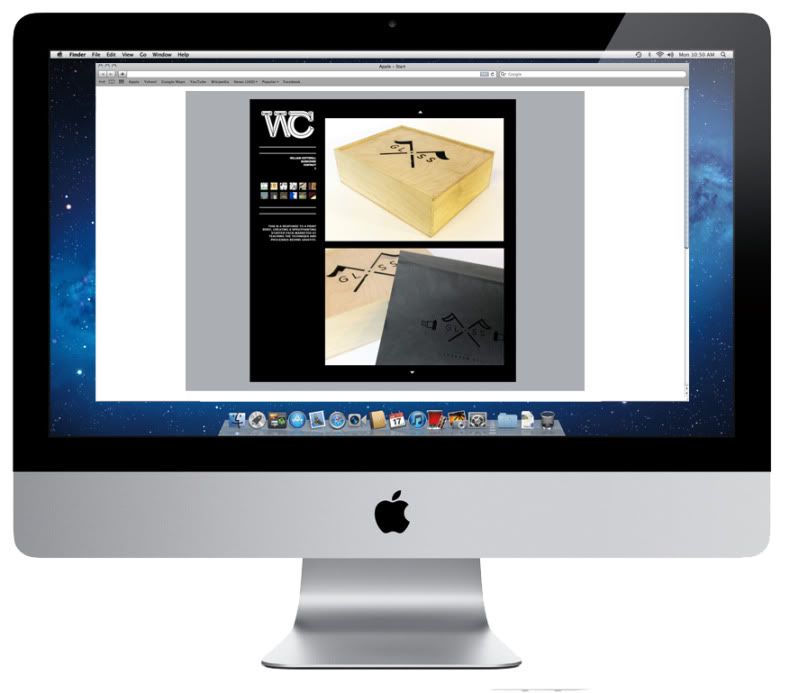
Below are some mock ups of how I want my final website to appear. I decided to stick with the grey black and white colour scheme for the time being giving me a chance in the future to come back and add a bit more colour, I think once I have it uploaded and ready to go on a domain name and have my hosting sorted I'll start to finally tweak areas of the coding in relation to design.


Mocked up on screen, I have considered how the restrictions of working to 1600x800 can change aspect ratio's of images and content when using a different device other to a computer. The format of my website will have to be touched up a little because I can imagine they're will be difficulty when viewing it on a tablet or phone. 


Sunday, 27 May 2012

PPD - Website development

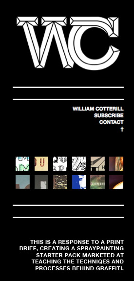
So far I've produced a series of different scamps and being playing around with different visual outcomes for my personal branding. From the sessions with Simon and Lorraine and some help from books in the library I've gained a basic knowledge in HTML and CSS, below I've started to put together a basic idea for my website, sticking to the same theme as my blog and tumblr so they are all consistent.


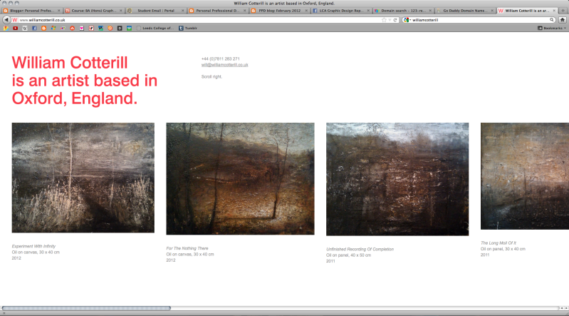
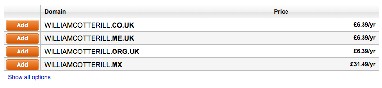
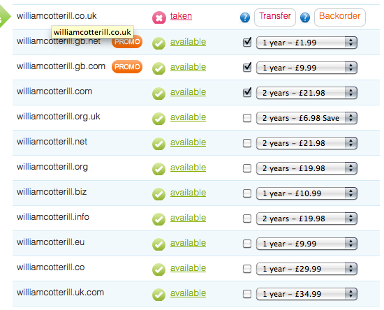
The username williamcotterill.co.uk has been taken already by an artist in Oxford who shares the same name as me, coincidentally I think his website is very visually appealing, simplistic, and works very well for a horizontal scroll. However as that was my ideal web address I'll have to search for another. Below are a few quotes I've got for different usernames so far...


A few different colourways....

Even though I want to keep as consistent as possible to my tumblr and blogger, Experimenting with colour has been really productive in generating more ideas for my website. I Think it would be nice to have the same layout for each one of my networking options but each one to have a different colour theme/gradient.


I tried to keep the links and buttons as user friendly as possible and easy to understand, on the right hand side my content will be displayed and on the left links to subscribe and contact + a small blurb about the work you're viewing. I thought the grid of small thumbnails immediately communicates that they have some sort of function so no need for an explanation cluttering up the rest of the page.
 

I felt as if there was no need for a scroll or a bar either side of the page but instead just two small arrows that could be easily recognizable as moveable buttons. The content displayed on the right hand side of the page will be navigated by simply clicking the small arrowhead at the top of the page or the small arrowhead at the bottom.


When a new project/brief is selected from the archive of thumbnails on the right hand side the content below underneath the separator will change accordingly to the content displayed on the right hand side of the page.


PPD- Final Buisness Cards + Mailout

Below I have Printed my business cards and letter heads, I chose to use a thick white card stock for the buisness cards, but when printed professionally they will logo on the front will be black spot varnish on 120gsm.


Below are a couple of quotes I've been looking into so far regarding the printing of my business cards. If I decide not to print them with a company and do them myself I think they would be ideal to screen print.

http://uk.moo.com/