Thursday, 31 May 2012

PPD - Final Website

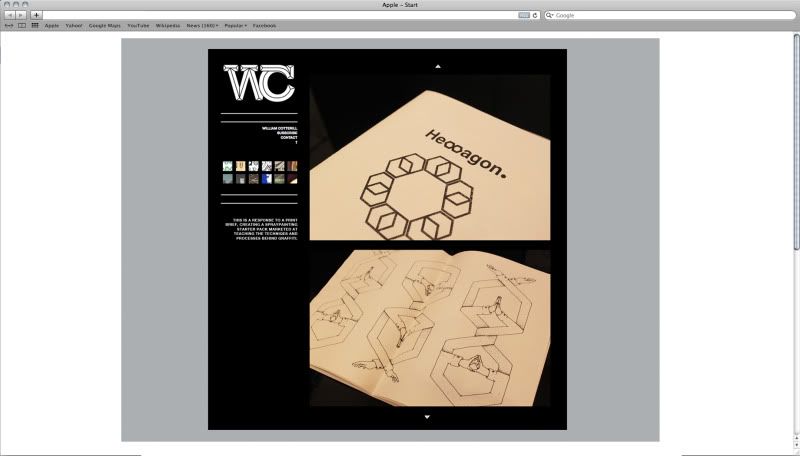
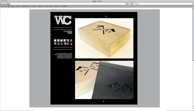
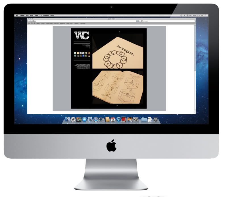
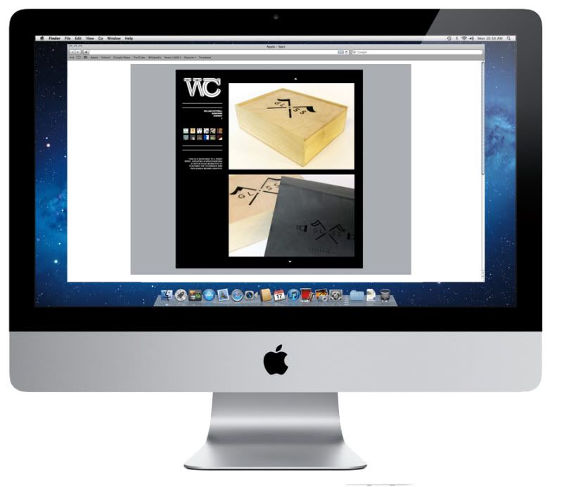
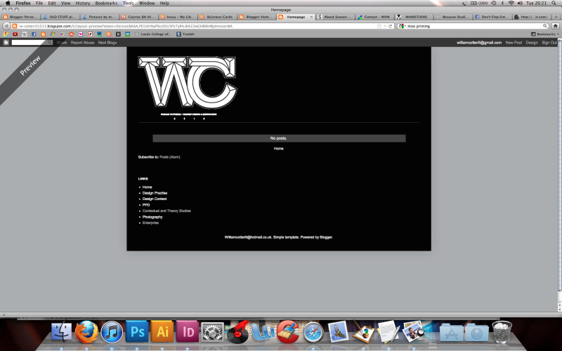
Below are some mock ups of how I want my final website to appear. I decided to stick with the grey black and white colour scheme for the time being giving me a chance in the future to come back and add a bit more colour, I think once I have it uploaded and ready to go on a domain name and have my hosting sorted I'll start to finally tweak areas of the coding in relation to design.


Mocked up on screen, I have considered how the restrictions of working to 1600x800 can change aspect ratio's of images and content when using a different device other to a computer. The format of my website will have to be touched up a little because I can imagine they're will be difficulty when viewing it on a tablet or phone. 


Sunday, 27 May 2012

PPD - Website development

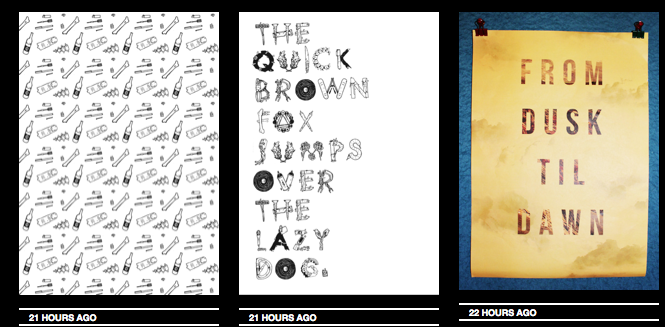
So far I've produced a series of different scamps and being playing around with different visual outcomes for my personal branding. From the sessions with Simon and Lorraine and some help from books in the library I've gained a basic knowledge in HTML and CSS, below I've started to put together a basic idea for my website, sticking to the same theme as my blog and tumblr so they are all consistent.


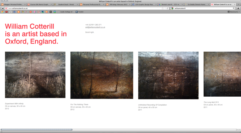
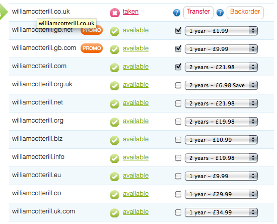
The username williamcotterill.co.uk has been taken already by an artist in Oxford who shares the same name as me, coincidentally I think his website is very visually appealing, simplistic, and works very well for a horizontal scroll. However as that was my ideal web address I'll have to search for another. Below are a few quotes I've got for different usernames so far...


A few different colourways....

Even though I want to keep as consistent as possible to my tumblr and blogger, Experimenting with colour has been really productive in generating more ideas for my website. I Think it would be nice to have the same layout for each one of my networking options but each one to have a different colour theme/gradient.


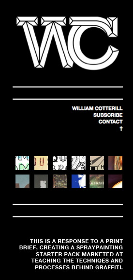
I tried to keep the links and buttons as user friendly as possible and easy to understand, on the right hand side my content will be displayed and on the left links to subscribe and contact + a small blurb about the work you're viewing. I thought the grid of small thumbnails immediately communicates that they have some sort of function so no need for an explanation cluttering up the rest of the page.
 

I felt as if there was no need for a scroll or a bar either side of the page but instead just two small arrows that could be easily recognizable as moveable buttons. The content displayed on the right hand side of the page will be navigated by simply clicking the small arrowhead at the top of the page or the small arrowhead at the bottom.


When a new project/brief is selected from the archive of thumbnails on the right hand side the content below underneath the separator will change accordingly to the content displayed on the right hand side of the page.


PPD- Final Buisness Cards + Mailout

Below I have Printed my business cards and letter heads, I chose to use a thick white card stock for the buisness cards, but when printed professionally they will logo on the front will be black spot varnish on 120gsm.


Below are a couple of quotes I've been looking into so far regarding the printing of my business cards. If I decide not to print them with a company and do them myself I think they would be ideal to screen print.

http://uk.moo.com/


PPD - Web Presence Tumblr

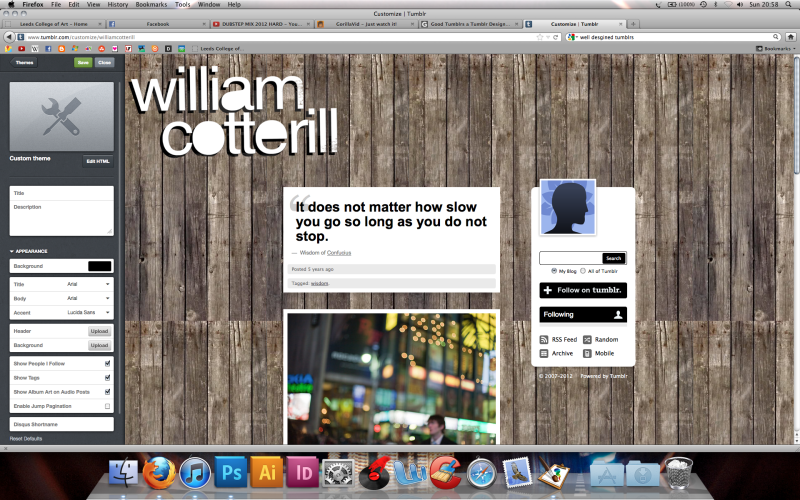
Networking and getting involved in online creative clusters is going to be a major part of my professional development as a designer. At this stage I want to focus on the building of my own personal web address but also have parallel links to other locations Online where I'm getting my work out there. When I was 14 I decided to make a tumblr, the screenshot is below ( You can tell how old I was because of the poor design haha!) Tumblr is a perfect location to start reaching the sorts of contacts I want to come across in my design career. Its full of creative people from all different backgrounds and is really focused on artistic interests. I've been re-vamping the html for my Tumblr for quite a while, below is what I've come to produce, the only final thing I need to code is infinite scrolling.

http://williamcotterill.tumblr.com/

5 years ago...


Revamp...


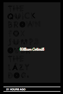
Understanding the tumblr style sheets was my first issue, I used some sourced code of the internet to help to to set up my page. One of the features used is a rollover so that when hovering over an image it fades into the background, in the foreground my name becomes the click able item.


The black grey and white is going to be an ongoing colour scheme across my personal branding, from my google blogger to my website. Below is a few images of my blogger with the same consistent branding;

Saturday, 26 May 2012

PPD - Making Your Mark Letterhead

So far I think I've come up with some consistent branding for my personal and professional work that communicates both me as a designer and as an individual creative. Below are a range of deliverablea I've formatted my logo to. The main one being a letter head Ideal for sending out to clients/agencies when doing Live briefs or contacting someone in regards to work.


PPD - Don't Flop Contact

After finishing the last Module I thought it would be ideal to put my project into practice, I decided to contact the organization I produced my publication for in order to see whether they'd want to use any of my illustrations/designs. They'd mentioned on some of there most recent youtube videos that they were considering bringing out a publication/zine.


PPD // Buisness Cards for John

I sent my Business cards to John this morning as a PDF i still haven't come to conclusion on which one to use however It has been suggested that I could have a variation of three consistent designs just switching between my hand rendered logo and vectorized logo.

Friday, 25 May 2012

PPD - Studio research

I've been researching into a lot of studios abroad and I feel that If I'm staying in Leeds over summer It would be a much better plan to try and find some contacts in yorkshire and the county as a whole as travel costs would be reduced. 

Quibik


Qubik is a design studio based in Leeds, They appeal to me because of their current up to date type orientated, experimental approach to design. Each project I've selected from there archive has been constructed from an original and intuitive concept, each one unique and backed by good reasoning. I think as a designer this would be the type of studio I would love to work within, working mainly with publications and print, establishing and developing visaully pleasing work for small clients. 


"Qubik is a graphic design studio founded in 2000 by Joe Gilmore. Specialising in typographic-led design for branding, print and digital media, the studio works with a variety of clients in the commercial and cultural sector. Our work includes design for branding, content managed websites, books, catalogues, brochures, posters, leaflets, signage and packaging. In addition to client-based work, the studio initiates and produces independent curatorial and publishing projects which focus on typography and graphic design.

We are very passionate about graphic design. Through developing collaborative relationships with our clients and partners we aim to create original, functional and distinctive work that engages users, satisfies the objectives of the client and meets the high standards and creative innovation that are central to our studio practice. 

Joe Gilmore is currently a visiting lecturer in the department of Graphic Design at Leeds College of Art & Design. He is also a founding member of The School of Interactive and Algorithmic Art."


Strengths: They're current/up to date, producing design that is fitting with graphic influenced trends. They have been running since 2000 and have a wide client base, plus with 12 years behind them they are obviously doing the right things.

Weaknesses: They're mainly type orientated, where as I would say I'm more image.

Opportunities: Quibik offers the chance to work alongside designers who have a strong passion for graphic design, this can be seen through the sort of work they produce. It motivates/inspires me backtracking through their work and thinking about the thought process behind each concept. I would love to work with more type orientated design as a pose to image. 

Threats: I think a threat to myself would be that my portfolio is not 100% how I would like it to be. I feel as If I don't have strong enough work at this stage of the course for a company with graphical prestige. 


The Consult


The Consult is a team of brand and design experts. For the past decade we've been delivering impact-making communications for our clients and their brands.

"We realise the importance of thinking things through. Understanding your market and strategic objectives is an integral part of our design process. That way we know we're delivering creativity that works."


Brand communications
Stationery
Posters / Flyers
Brochures / Books
Annual reports
Magazines
Packaging
Exhibition displays
Mailers
Folders
Signage
Vehicle livery
Photography
Copywriting

Strengths: They're local, offer a wider range of deliverables across both web and print

Opportunities: The consult offers a chance to work with lots of desirable outcomes and formats. I want to develop my skills within product range and distribution and The consults multiple integrated campagns work across really enthralling ranges.

Threats: Again portfolio issues, I don't feel as if A company like this would take interesting in myself with my work being at the stage its at.

Wednesday, 23 May 2012

PPD // Buisness Card Feedback

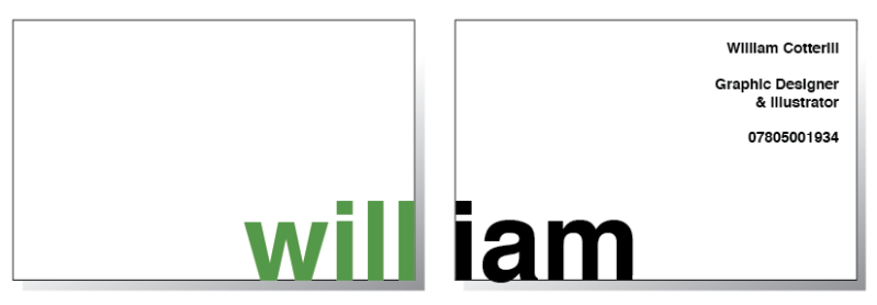
Today I spoke to john and took along some print outs of my buisness cards to get some feedback on they're appearance and impact coming from an industrial point of view. Overall the feedback was good but they're are a few things I still need to amend. The kerning on some of the letters within my contact details is too tight and some of the boundaries need connecting. One idea which I was really fond of was producing a business card that has my name wrapping around the front and back so it reads I am will rather than will I am. Some of the notes I made are below.


A few of the changes I've made so far;


Thursday, 17 May 2012

PPD // Janes Feedback

A bit of feedback from Jane and some notes on where I need to progress forward from here. I have an idea of what I want to do over summer but I'm not yet sure what area of graphic design I want to go into so any sort of placement internship or visit is a bonus. My sister Lives down in London and has contacts within advertising departments, and some friends in retail. This is something I definitely want to pursue alongside my own contact with industry.

Wednesday, 16 May 2012

PPD - Contact Devlopment

After looking at a variety of different studios I'd like to visit, I have started to get an Idea of the places I'd like to travel to, I would definitely like to go abroad, sticking within Europe and visiting places like Brussels and Prague. Amsterdam and Germany would be current and exciting places to visit, however a little closer to home My sister lives down In London and has some contacts within advertising agencies and other departments. This is an opportunity I can't waste, one of her close friends works with the clothing company Whiter Stuff. As I would love to go into retail and design for fashion I think pursuing this contact would be ideal for my professional development.


http://www.theminimart.com

Another company she has links with is the Minimart. They're an advertising and marketing agency who produce fully integrated marketing campaigns, working with companies such as the BBC, Atari, Rubicon. They mainly work with commercial advertising but visually have produced some amazing digital and printed media for clients as seen below. Another thing which I find really attractive and exciting about the company is there Idents/video work, something I would like to pursue from the design for screen module. They have also had a lot of envelopment with charity and ethically friendly projects, I really like the fact they've worked with macmillan & water aid.


An introduction to Minimart;

Monday, 14 May 2012

WEB // Lorraines Sessions

Throughout Loraine's sessions on a Thursday Morning and Afternoon, we've been picking up on a few area's that we didn't fully understand when being taught by Simon. Basic CSS and HTML really interests me, this week we've been learning about lots of different helpful pockets of information. I've learnt that theres a huge difference between a web coding and website design, for example when being employed we wouldn't take on the role of linking websites with databases, maintenance and accessibility but instead designing the user Interface and the general look of the pages.


HTML Basic Document

<html>
<head>
<title>Title of document goes here</title>
</head><body>
Visible text goes here...
</body>

</html>

Heading Elements

<h1>Largest Heading</h1>

<h2> . . . </h2>
<h3> . . . </h3>
<h4> . . . </h4>
<h5> . . . </h5>

<h6>Smallest Heading</h6>

Text Elements

<p>This is a paragraph</p>
<br /> (line break)
<hr /> (horizontal rule)
<pre>This text is preformatted</pre>

Logical Styles

<em>This text is emphasized</em>
<strong>This text is strong</strong>
<code>This is some computer code</code>

Physical Styles

<b>This text is bold</b>
<i>This text is italic</i>

Links

Ordinary link: <a href="http://www.example.com/">Link-text goes here</a>
Image-link: <a href="http://www.example.com/"><img src="URL" alt="Alternate Text" /></a>
Mailto link: <a href="mailto:webmaster@example.com">Send e-mail</a>

A named anchor:

<a name="tips">Tips Section</a>
<a href="#tips">Jump to the Tips Section</a>

Unordered list

<ul>
<li>Item</li>
<li>Item</li>
</ul>

Ordered list<ol>
<li>First item</li>
<li>Second item</li>
</ol>
Definition list<dl>
<dt>First term</dt>
<dd>Definition</dd>
<dt>Next term</dt>
<dd>Definition</dd>
</dl>

Tables

<table border="1">
<tr>
<th>Tableheader</th>
</tr>
<tr>
<td>sometext</td>
<td>sometext</td>
</tr>
</table>

Iframe
<iframe src="demo_iframe.htm"></iframe>

Frames

<frameset cols="25%,75%">
<frame src="page1.htm" />
<frame src="page2.htm" />
</frameset>

Forms

<form action="http://www.example.com/test.asp" method="post/get">

<input type="text" name="email" size="40" maxlength="50" />
<input type="password" />
<input type="checkbox" checked="checked" />
<input type="radio" checked="checked" />
<input type="submit" value="Send" />
<input type="reset" />
<input type="hidden" />

<select>
<option>Apples</option>
<option selected="selected">Bananas</option>
<option>Cherries</option>
</select>

<textarea name="comment" rows="60" cols="20"></textarea>

</form>
Entities&lt; is the same as <
&gt; is the same as >
&#169; is the same as ©

Other Elements

<!-- This is a comment -->

<blockquote>
Text quoted from a source.
</blockquote>

A few quick scamps below and ideas for the layout of my website. We did a session where we received feedback on our scamps, I found that the overall outcome was that I overcomplicate things too much. This seems to be a growing trend across the different aspects of graphic design, simple and plain design is effective plus will be much easier for users to navigate around. 


Below are a few of the bits of feedback I received;


Sunday, 13 May 2012

PPD - Creative CV


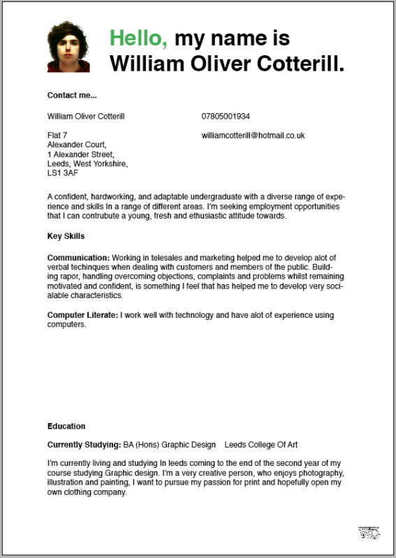
So far I've been developing a few ideas towards my creative CV. I want to produce a CV that's universal to the people I send them out to but at the same time tailored to the client/company who receives it. So far I've come up with the basic layout as shown below. Just working with some basic information and a layout to continue editing.


Tuesday, 1 May 2012

PPD - Samples of Work (Research & Analysis)

Based on the exercises, feedback and discussion in the studio workshop:

Part 1 - Identify document and evaluate a minimum of 10 examples of professional designer's and/or design studios who have used a range of media and formats to distribute samples of their work. You should aim to select a range of examples using a rage of media.

Part 2 - Produce a short (50 word) SWOT analysis of each example in order to analysis its relative merits and effectiveness as a promotional tool or strategy.

SWOT = Strengths, Weaknesses, Opportunities, Threats

At the end of the summer in the first two weeks before we start back In September me and a couple of other course mates plan on traveling across Europe with an international rail card to do a bit of traveling. On our Journey it would be a huge advantage to visit some studios whilst we're away, Below I've split my task up into two sections, studios from the U.K and studio's from abroad.
Bleed Norway

This studio would be amazing to pop in and visit let alone get a placement with, they cover so many different aspects of design that make me thrive. They're website is crisp, the page transitions are so smooth!


Their About Section;
"Bleed is a multi-disciplinary design consultancy based in oslo Norway, established june 2000. working to challenge today’s conventions around art, visual language, media and identity.

Bleed’s work spans brand identity and development, art direction, packaging, printed matter, interactive design, art projects and exhibitions.

Both our client list and creative output has become diverse and interesting, and made us one of the most awarded agencies in Norway, with international and national acclaim.

we believe in the power of visual language. our work deals with long term brand-strategies as well as keeping it fresh by constantly challenging the boundaries of design and media"

Strengths: They cover a diverse range of subject matter and deliverable , they travel across a broad range of print productions and process and as a result produce really exciting work.

Weaknesses: Maybe be a language barrier if doing a visit, could be a problem in contact however I'm sure some sort of conclusion would be made.

Opportunities: They work with fresh and current brands and clients such as Levis and MySpace, working with a studio alike to Bleed would offer lots of industry opportunities.

Threats: It's a long way to travel, I don't feel as if my work is anywhere near they're standard at this stage of me developing as a designer.


Snasen- Norway


Robin Snasen RengÄrd is a graphic designer, illustrator, and musician living and working in Oslo, Norway. He is a part of ByHands illustration agency. He is also a co-owner of Bilo Books - an independent publisher specializing in limited edition books for visual arts.


Strengths: Its individually run, an agency that works with mainly illustration and manipulated type which I'd say was one of my strongest passions.

Weaknesses: If the studio is self run it could be strange asking for a visit.


Opportunities: A chance to develop my knowledge on illustration and working with diverse media.


MVM - Norway


MVM's focus is on research driven work.
A strong conceptual foundation is important to secure strong aesthetics.
Commercial and non-commercial work are equally regarded as important fields of exploration.

MVM is working in the fields of graphic design, art direction, typography, illustration and art related projects.


Strengths: Its individually run, an agency that works with mainly illustration and manipulated type which I'd say was one of my strongest passions.

Weaknesses: If the studio is self run it could be strange asking for a visit.


Opportunities: A chance to develop my knowledge on illustration and working with diverse media.


Mainstudio Amsterdam


Mainstudio's projects include editorial design, books and visual identities for
clients within architecture, art and fashion. Based In Amsterdam.


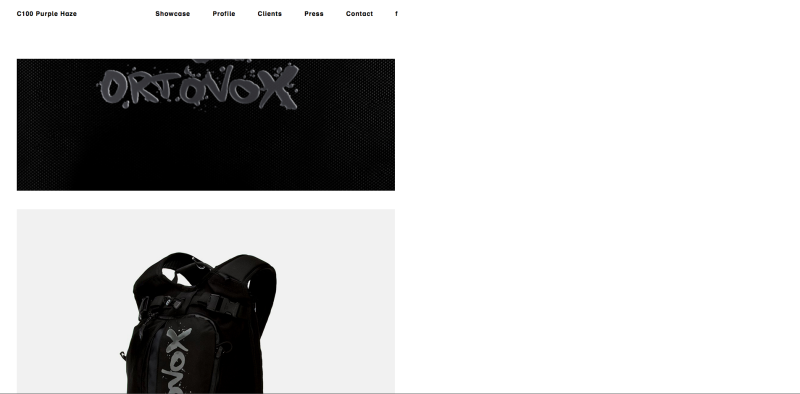
C100 Purple Haze Germany


http://c100purplehaze.com/


Burn Everything Liverpool


Becausestudio - Preston


http://www.becausestudio.co.uk


Branding, art direction, print and website design, the starting point for every project is an informed approach and an attention to detail, with the aim of creating engaging, well-crafted answers, whatever the brief.

Selected clients include Adaptavist, Carbon Co-op, Co-operatives UK, Creative Lancashire, DEA, Growing Our Future, Mines Advisory Group, Manchester Craft Mafia, Manchester University, New Economics Foundation, OpenSpace, The Pipeline Project, Rosie Anderson, SewSew, Substance Co-op, LowWinterSun, Single Cell, Salford Health Matters PCT, Tilt