Coincidentally, I was doing a bit of personal spray painting work in the
bar in escobar a small bar in town and got chatting to their manager Shaun who owns
both bar and restaurant above it. He's currently undergoing idea's for refurbishments of his Mexican restaurant and was looking for artists to stick with his Mexican theme re-decorating the walls of the restaurant to bring it up to date with their new menu's etc.
At the back of the restaurant there's a small corner where I thought it would be ideal for me and Sadie to base our brief, 2 walls have a painted map of Mexico with short paragraphs about the Mexican day of the dead and Mexican heritage. The owner wants this re-doing with work corresponding to the information on the map positioned around other areas of the restaurant. Even though this is moving away from clothing shop interiors, I think a restaurant this central and lively is such a good opportunity that needs to be grabbed straight away, It will give us the chance to explore restaurant interiors and how they interact with their customers.
Below I have re-written Our brief to fit Escobar's requirements;
Restaurants accommodate customers by providing a full experience to eating out, It's not just about the food, but instead about the experience as a whole, how the food and environment come together to provide an overall aura . Explore how retail graphics, installations, exhibitions and way finding are used within a restaurants interior to suit and compliment the surroundings.
-A mixed media investigation of retail graphics and shop interiors with a focus on Mexican food, the mexican day of the dead, sugar skulls and Mexican themed subject matter. Using screen-print and laser cutting we want to look into multi-layered posters, wall hangings and 3 dimensional pieces of print. This will be proposed to a high street shop tailoring our ideas to a specific audience.
Skill set: Digital Illustration, Hand Rendered Illustration, working to exhibit, screen-printing, laser-cut.
Deliverables;
-A proposed Interior restaurant Installation.
-Backdrop of a Map (wallpaper/print)
-5 A1 mixed media prints.
Tuesday, 23 October 2012
Saturday, 13 October 2012
Proposal : Rational & Statement Of Intent
This week I produced my rationale and statement of intent for our crits, I analyzed all my yearly aims and prospects for this semester then structured my briefs around the practical skills I want to achieve this semester. Balancing my briefs, so that they are very diverse in terms of content, context and method of delivery. I feel as if I have a set of very contrasting briefs, 2 Live Briefs, 2 Collaborations and a personal brief to get started on between here and Christmas.
PPD Task 2
Identify 5 companies/studios which you consider potentially synergetic to you personally. Write a short explanatory paragraph and reasons for each.By the end of this year I think that I would feel more comfortable approaching individual designers/artists because I feel within Industry I would work better as a freelancer or graphic artist. The style of Graphic Artist I would like to be is shown by the breadth of links below, But I've included design studios to highlight the type of working environment I would seek to enter into.
http://workingformat.com/
We
design brand identities, publications, websites, exhibitions and
typefaces for cultural institutions, civic and government organisations,
educational facilities, passionate startups and national corporations.
Our process is based on the principal that great design starts with
great content. Build great content and communicate it in a way that
encourages positive user experiences. Create positive experiences
through better looking products and services. Customers will follow.
I would love to travel the world whilst I'm young and Canada would be my first destination, I've visited Vancouver and the city is engulfed by creative clusters and projects going on around the city. Working Format work has ethical outlooks and works alongside brands and companies that stand for change and have passion in their making. I couldn't agree with their strap line more that Great design starts with great content, I think that the more exciting a subject the more exciting a brief, but its up to you to make it exciting.
http://99seconds.com/
Company Overview
99SECONDS is the studio ID and portfolio of Bristol based illustrator / designer Adi Gilbert. I work as a freelancer or from my own studio specializing in illustration and graphic design with over 13yrs of experience as a professional creative.
Illustration / Graphic Design / Web / Art and creative direction / Branding / Animation / visuals, storyboards and scamps / art working
99SECONDS appeals to me because of their diversity, working heavily with both illustration and graphic design, which is eventually what I would like to do. Bristol is an Area I've always aspired to work/live in and I think this studio would be right up my street. Adi's illustration work really inspires me because of its minimal colour palettes and attention to detail, they work mainly with companies affiliated with extreme sports such as skating, bmx'ing which is also a big interest of mine.
http://ilovedust.com
Company Overview
I picked out I love Dust because they work within the three main Areas i want to tailor my practice towards, they work alongside exciting and modern brands and produce work that is well balanced but decorative. Working near in London has many advantages and the majority of well known creative studios are Based in the South of the Country.
http://leifpodhajsky.com/
http://tomgilmour.tumblr.com/
http://www.megamunden.com
Identify the top choice and why you feel that they may have synergy with your practice now, or in the near future.
Is your choice based on:
Location, Direction of Practice, The brand Philosophy & Client base
What if none of those is your main reason for choosing to follow this organization, what is it specifically?
When considering these practices:
Please Consider who they are/who are you?
Why you are contacting them and why they should listen? What do you want them to do next and what do you actually want. Why they should get back to you?
Now you have identified initially these studios you feel synergy with. Please list 8 methods you could utilize to contact them.
-Emails (Integrated PDF's) and interactive links out to Websites.
-Mailouts/mailshots, precious pieces of print my client can feel and hold.
-Online Presence: Creating online status and presence through Tumblr, Linkdin, Blogger etc
-
http://workingformat.com/
About
Working Format is a graphic design studio founded by partners Ross Milne and Grace Partridge. We are based in Vancouver, Canada.
Company Overview
Description
Great design starts with great content.
Better looking products and services will be better received, always.
People are smarter than they're given credit for.
Craft is important: the only thing worse than a bad idea is a good idea poorly executed.
We're curators at heart. It's our job to be critical.
Better looking products and services will be better received, always.
People are smarter than they're given credit for.
Craft is important: the only thing worse than a bad idea is a good idea poorly executed.
We're curators at heart. It's our job to be critical.
I would love to travel the world whilst I'm young and Canada would be my first destination, I've visited Vancouver and the city is engulfed by creative clusters and projects going on around the city. Working Format work has ethical outlooks and works alongside brands and companies that stand for change and have passion in their making. I couldn't agree with their strap line more that Great design starts with great content, I think that the more exciting a subject the more exciting a brief, but its up to you to make it exciting.
http://99seconds.com/
Company Overview
99SECONDS is the studio ID and portfolio of Bristol based illustrator / designer Adi Gilbert. I work as a freelancer or from my own studio specializing in illustration and graphic design with over 13yrs of experience as a professional creative.
Illustration / Graphic Design / Web / Art and creative direction / Branding / Animation / visuals, storyboards and scamps / art working
99SECONDS appeals to me because of their diversity, working heavily with both illustration and graphic design, which is eventually what I would like to do. Bristol is an Area I've always aspired to work/live in and I think this studio would be right up my street. Adi's illustration work really inspires me because of its minimal colour palettes and attention to detail, they work mainly with companies affiliated with extreme sports such as skating, bmx'ing which is also a big interest of mine.
http://ilovedust.com
Company Overview
We are ilovedust, a multi-disciplinary design
boutique. We specialise in creative solutions from graphic design and
illustration to animation and trend prediction.
We ply our trade in two contrasting studio spaces; one located in the heart of East London, the other on the tip of the south coast. Just a short stroll from the ocean and surrounded by the rolling Hampshire countryside, our south coast team enjoy a distinct vantage point working in a former butcher’s workshop.
Conversely rooted in the heart of creative hub Shoreditch, our London studio thrives on the buzz and energy of the city in a brand new, purpose-built creative haven. The blend of both environments provides us with a unique and inspiring perspective.
We mix some of the best British designers along with talent from around the globe.
We collaborate both in-house and with global brands, working together to create fresh, innovative design which makes up our award-winning portfolio.
I picked out I love Dust because they work within the three main Areas i want to tailor my practice towards, they work alongside exciting and modern brands and produce work that is well balanced but decorative. Working near in London has many advantages and the majority of well known creative studios are Based in the South of the Country.
http://leifpodhajsky.com/
http://tomgilmour.tumblr.com/
http://www.megamunden.com
Identify the top choice and why you feel that they may have synergy with your practice now, or in the near future.
Is your choice based on:
Location, Direction of Practice, The brand Philosophy & Client base
What if none of those is your main reason for choosing to follow this organization, what is it specifically?
When considering these practices:
Please Consider who they are/who are you?
Why you are contacting them and why they should listen? What do you want them to do next and what do you actually want. Why they should get back to you?
Now you have identified initially these studios you feel synergy with. Please list 8 methods you could utilize to contact them.
-Emails (Integrated PDF's) and interactive links out to Websites.
-Mailouts/mailshots, precious pieces of print my client can feel and hold.
-Online Presence: Creating online status and presence through Tumblr, Linkdin, Blogger etc
-
Friday, 12 October 2012
Proposal : Timeline
Below I have produced a timeline for my 5 briefs, categorizing their importance over the 10 weeks and allocating specific days and weeks to certain areas of the design process. The two main briefs I aim to complete run for 10 weeks where as my other 3 briefs that won't be as demanding have been allocated 3/4 weeks.


Friday, 5 October 2012
PPD Tutorials - Task 1
From John's session this week we were given a short task of answering the questions below;
List 5 things or more you would address differently than you did before the summer...
List 5 things or more you would address differently than you did before the summer...
-The amount of time I spend In studio, I definitely will be taking advantage of having studio space open for us to use 6 days a week, as this is probably going to be my last year in education using the studio as much as possible Is something I want to prioritize.
-To use the research process in much more original and interesting ways, rather than jumping straight onto the internet instead finding day's out and visits that can inform my research. Using other resources than the colleges Library and being thorough in the way I execute research.
-To use the research process in much more original and interesting ways, rather than jumping straight onto the internet instead finding day's out and visits that can inform my research. Using other resources than the colleges Library and being thorough in the way I execute research.
-Try and be much more experimental with the media and methods of delivery I work alongside, I want to show that I'm a jack of all trades and enjoy working in in alternative forms of media that wouldn't usually be associated with Graphic Design.
-In terms of my attendance I feel that last year there was a few mornings where I woke up late and didn't get a chance to sign in, overall effecting my percentage. This year I want to manage my time so that I don't end up having late nights catching up with blogging etc and as an outcome I don't sleep through my alarm.
-In terms of my attendance I feel that last year there was a few mornings where I woke up late and didn't get a chance to sign in, overall effecting my percentage. This year I want to manage my time so that I don't end up having late nights catching up with blogging etc and as an outcome I don't sleep through my alarm.
-The design Process, Coming back and analyzing the briefs I've picked out has really helped me to think about the differently stages undertaken in the design development process. Weekly plans of each stage you intend to go through is a really good aspect of project planning and this is something I will be undertaking this year.
List 5 things or more know now that you didn't before the break...
-Stressing out over work, is only achieved through bad planning. Project and time management is key to being able to structure time to work & procrastinate.
-I aspire to be open minded this year in terms of industry, I think I will be happy in whatever job I end up doing as Long as its part of the creative network. Having time and space over summer gave me a chance to properly think about my future and I have concluded that If i don't pursue a graphic design career, I would definitely like to stay within the creative Industry possibly with textiles or illustration.
-I know now that speaking to other designers through creative Industry can be very difficult but at the same time extremely easy, it completely depends on the other person at the end of the telephone line or computer screen.
-I know what type of designer I work well alongside collaboratively, I completed a 10 day collaborative mural over summer and I truly think that this taught me alot about compromise and pushing different peoples strong points.
-I know what type of designer I am now, strangely coming back to University I feel really motivated about my own practice as summer has given me a chance to understand who I am within Graphic Design. I'm a graphic designer who works well with image, has an eye for composition and enjoys illustration but can work in a breadth of different types of media.
List 5 things or more you feel we could address as a group...
-Group Visits to Studios and printing companies.
-Some feedback forms on what types of sessions we feel would benefit us this year.
-Feedback on Taught sessions and our advice on how to Improve the teaching of graphic design for following years.
-A creative project where everyone in the class has to contribute, I.e A branding and identity brief where everyone in the class has to propose a logo to a specific size and format, this could turn out to be a print showing the diversity in the way the class thinks.
-More hands on practical sessions, where we learn about skill driven design.
List 5 or more specific things you will address this semester that should be useful to your practice...
-A continuation of constant practice of my drawing, I just want to keep touching up and perfecting my style of illustration and this is only going to be achieved through repetition and trying out new techniques.
-My collaborative Skills, I have 2 collaborative briefs written out for OUGD301, I've learnt the importance of collaboration over summer and now its time to perfect the way I work with other people.
-My typographic knowledge, I think my biggest mistake of last year was picking image over type as type is something that as the course has progressed I've moved further and further away from. I want to be able to grasp the fundamental and technical aspects of arranging typeface and traditional rules of typesetting.
-I want to arrange to meet more studio/professionals, to broaden my knowledge on where I want to end up at the end of the course. Meeting successful designers and popping into studios will help me to understand the sort of environment I eventually want to enter into.
-My online status is something I really want to get going, especially for getting myself business contacts and work. I'm going to start with creating a behance and cargo collective.
4 Selected Briefs/Development
Below is a re-vamped selection of the 4 Main Brief I Intend on completing in the next ten weeks. Analysing the skills content, context and products I aim to work with.
Shop Installation /Collaboration with Sadie
Skills - Collaboration skills working with another designer/illustrator, printing techniques, concept development and working to a set space/area. 3D craft, media and material manipulation.
Shop Installation /Collaboration with Sadie
Skills - Collaboration skills working with another designer/illustrator, printing techniques, concept development and working to a set space/area. 3D craft, media and material manipulation.
Content- Anatomy and the human body, sketal system and muscles. Mechanics and car engines, clocks and cogs.
Context- Design for retail, Fashion and Interiors.
Products- Wall Hangings, 3D/ Multi Layered Prints. screen prints, oil paintings, 3d craft and media, the possibility of producing wallpaper and printed fabrics to go alongside.

British Humour /Collaboration with James
Skills - Type driven, collaborative skills, spray painting techniques and traditional sign writing. Also a good use of After effects as we propose to produce a motion graphic to run alongside.
Content- British Humour, Young aspiring comedians. what makes British humour unique from other nationalities.
Context- Design for screen/working with live spaces
Products-1/2 mural spray painted murals, laser cut 3d work and screen prints.

Personal Garment Printing Brief / The Universes Pupils
Skills - Screen printing on garments, Networking, Website coding and development, branding and identity, Sewing/Pattern/Textile design.
Content- Skateboarding culture, Victorian typography and traditional crests, current trends and pattern.
Context- Online/ Website Exposure, Design for Fashion and retail. Printed media.
Products-10 or more t-shirts, 2 Jumpers, labels, tags, and an online shop.

Live Brief F & J Groundwork's and General Property Maintenance
Skills -Client Led Design on a live brief, working with transfers and decals, Branding and Identity and logo. Working alongside commercial printers.
Content- Plumbing, construction, roofing, brick layer, electronics.
Context- Design for coorperate identity.
Products-Van decals, business cards, letterheads, informative banner and other printed media.

Brief Devlopment Workshop 3 Timelines/Sentances
For todays session we had to re-write the four sentences we came up with last week but with an extended explanation, so that our briefs become much more focused and can be simply understood in a couple of brief sentences. As seen below;
-A print based investigation of retail and garment design with a focus on skateboard culture. I am going to develop my garment/textile printing skills working with pattern as this is an area I have yet had a chance to explore.
-A mixed media investigation of retail graphics and shop interiors with a focus on anatomy and mechanics. I am going to be as diverse and experimental as possible with my deliverable's because working for an exhibited space gives me the opportunity to do so.
-A client led investigation of branding, identity and logo with a focus on a home maintenance company. I am going to brand F & J groundwork's key to the services they provide and offer as they are looking for an innovative new image.
-A web Based investigation of British Culture, humor and young aspiring comedians with a focus on sign writing and British typography. I am going to focus on traditional British typography as I need to improve my Knowledge of type.
In today's issue we dealt with the next part of our planning that needs to be considered which is time. How will we effectively plan and manage our time to produce all the work we want to produce. How will this be effectively managed so our aims and objects get completed to a high potential by the deadline.?
We were given the task of writing down the design process across a timeline that was chopped into 10 sections representing the next 10 weeks ahead of us. I found this really useful in terms of thinking whether what I aim to produce is achievable within my time limit.

I have extended this further to produce a full timeline for the next 10 Weeks, as seen below;
Brief Devlopment Workshop 2
This weeks session continued on from Last weeks series of Lists, producing the same 5 sheets but this time in much more detail and 20 wants and needs rather than 10, Then producing a final list of 20 questions derived from the other sheets. I found this process of self analysis and constantly questioning who I want to be as a designer was overall very satisfying because It made me feel more decisive in terms of my professional practice.
From this we had to select just 4 of our briefs we thought had the most potential to push us as individuals and colour code them, highlighting what brief would be key to each aim or objective we'd written down. this was then matched up to our sheets of 20 wants and needs to figure out what briefs would be key for developing specific skills, portfolio, research and product.
We were then asked to write down the four briefs that we favored the most in terms of the potential achievements and diversity of areas of skill, In the format...
A.......Investigation of........with a focus on.......
I am going to......because......
-A print based investigation of retail and garment design with a focus on skateboard culture.
-A mixed media investigation of retail graphics and shop interiors with a focus on anatomy and mechanics.
-A client led investigation of branding, identity and logo with a focus on a home maintenance company.
-A web Based investigation of British Culture, humor and young aspiring comedians with a focus on sign writing and British typography.
Research

Questions

Skills

Portfolio

Product

Wednesday, 3 October 2012
Self Promotion Task
Self Promotion
For Wednesday's session, alongside our business cards we also needed to produce a piece of promotional material any format to be analyzed by other members of the group. Rather than producing a flyer or poster or something 2D I wanted to stick with my original intentions of my third year and produce something 3 dimensional. From my brainstorm below I started to think about a deliverable that would communicate not only my skills as a designer but my personality.


I thought that a beer bottle or label for a bottle of beer would be appropriate to communicate myself as a designer traditional to my British routes, I do enjoy a nice pale ale. Plus this would be a nice item that could be picked up and held by its viewer rather than being seen from a distance.
Idea's I wanted to play around with was the original wording of a beer bottle label, changing the nutritional information to facts about myself.
I came up with the idea of having the ABV percentage as the division between my skills and what sort of designer I am, explaining that I'm 60% graphic designer 40% Illustrator. On the side of the bottle I planned to design and make two small tags with the strap lines, Always half full, Never half empty to promote that I'm a positive thinker.
Process
Using a Sam Miguel bottle I took measurements and planned out how big I could work with the space on the glass, I actually thought that the Sam Miguel labels themselves weren't very effective when it came to using space to its full potential. After printing my labels I used the laminator and gold foil to foil block certain parts of my label, I used this technique to highlight key elements of my type that I wanted to be eye catching. I was thinking about extending this project into making a small crate of ales, I think if I sent out a six pack to a studio each with a different label, promoting a different skill, this would be a really good way of promoting myself.


Brief Devlopment Workshop 1
This weeks brief development sessions was about producing a series of lists to analyse the things we want to achieve and get out of this academic Year. The opportunities we want to pursue and the skills we want to practice, it was divided into 5 sections and we were given around 5/10 minutes to write down 10 wants and 10 needs for each different section;
questions, products, portfolio, skills, research
From this session we were told to go away and think about what we'd written down for each heading and then re-vamp our suggestions focusing on our negotiated briefs and aims for the year. I found this session helpful because I've started thinking about what sort of designer I want to be and what I need to do to achieve these qualities.


Monday, 3 September 2012
LEVEL 05/06 Progress Evaluation
Over the summer I have had alot of time to think about my practice and the way I want to head in the future. There are areas for improvement, areas I need to address and skills I need to progress with.
In terms of design for Print there are three main areas I want to capitalize on...publishing, retail and branding and identity as I feel my interests in second year started to sway more towards these three sections.
In terms of design for Print there are three main areas I want to capitalize on...publishing, retail and branding and identity as I feel my interests in second year started to sway more towards these three sections.


Sunday, 2 September 2012
Business Cards
Business Cards
For next Wednesdays session we needed to have a set of business cards to show we're progressing with our individual efforts of making a name for ourselves within the world of graphic design. Plus when the opportunity comes along what's worse than meeting a potential client and not being able to leave them with your details. Before summer I designed and printed some of my business cards but wasn't totally satisfied with their outcome, This week I've tried to pick up from the point I left them at and give them a bit of a re-vamp.


For next Wednesdays session we needed to have a set of business cards to show we're progressing with our individual efforts of making a name for ourselves within the world of graphic design. Plus when the opportunity comes along what's worse than meeting a potential client and not being able to leave them with your details. Before summer I designed and printed some of my business cards but wasn't totally satisfied with their outcome, This week I've tried to pick up from the point I left them at and give them a bit of a re-vamp.

In terms of budget I think sending
off my design to a printing company to get some nicely finished prints
would be ideal, but due low funds at the moment I'm pre-longing ordering
with a company. I think being given something handmade is much more
personal and satisfying to receive.


I started by thinking about what techniques I could use that I'm already well experienced in doing and would be effective as communicating myself as a designer. I found some hologram foil in screen print which as soon as I saw I thought would work well the stock I'd chosen. Using spray mount and a roller I layered up lots of piece of multi-coloured paper, so that the sides of my card would have a series of stock fading from yellow to purple. I thought this would link in nicely with the hologram foil print because when you hold it in the light you can see all the colours of the light spectrum.


Saturday, 1 September 2012
Second 5 Negotiated Briefs
Ministry Of Sound D & AD
Even though this is a brief from Last years D & A D it really interested me because it deals with design that is usually viewed in motion and understanding how people read design from a vehicle/train etc. The outcomes are a set of 3 A2 Posters for outside use but I plan on extending this to do flyer designs, a motion graphic and Sticker reel.

Live Brief F & J Groundwork's
F & J Groundwork's General Property Maintenance are a company owned by one of my friends dealing with general property maintenance and groundwork. They want a cooperate Identity creating producing the decals for 1 red transit van, Buisness Cards, Letter Heads and an Informative Banner.
F & J Groundwork's General Property Maintenance are a company owned by one of my friends dealing with general property maintenance and groundwork. They want a cooperate Identity creating producing the decals for 1 red transit van, Buisness Cards, Letter Heads and an Informative Banner.

Personal Brief - The Universals Pupils
I want to create a brand/clothing company thats ethical in terms of manufacture and innovative in temrs of design. Based around skateboarding culture and current trends, producing 10 t-shirt designs, Labels, 2 Jumpers a website and Online shop.

Collaborative Retail Graphics/ Installation
This is by far one of the most exciting briefs I've written so far, Its a collaborative brief between me and Sadie looking at retail graphics and shop installations, producing an exhibition based around anatomy and mechanics.

First 5 Negotiated Briefs...
Over summer I have derived a series of briefs to work with over third year, some based on improving my own personal practice and some working for live clients. I've realized that my social skills and easy ability to talk to people has helped me to negotiate work for live client Led Briefs. I want to focus on diversity within my briefs, looking at briefs that offer a very different set of deliverables and practical skills to the next.
British Humour/ Signwriting- Collaborative
British Humour/ Signwriting- Collaborative
This is a collaborative Brief I have set out to complete with James Flanagan, Looking at British humour and what makes British humour unique. We want to create a diverse celebration of British humour looking at traditional sign writing.

Competition - Prosthetic Records
Prosthetic Records are Looking for a designer to produce them a New t-shirt design, I want to extend this brief looking at metal music, producing a metal influenced typeface and series of designs that give a metal orientated record label a new look. This will be a combination of type and image and branded accordingly to the record labels heritage and roots.

Personal Brief - Web Presence
A personal brief, boosting my online presence and online promotion. How can I use online status to its full potential? With the outcomes of a fully linked website, motion graphic, tumblr and blogger.


Live Brief - Thick as Thieves
Working alongside a Local band, re-branding their existing identity across an album cover, flyers promotional material and a banner. A completely different genre of music to my other live music orientated brief, offering a different branch to music communicating through design.
1 x 2 metre banner, 1 front cover, logo, flyer and vinyl sleeve.

Live Brief - Standard Manouevres
A live brief for a local band communicating exciting and innovative new music from the north west of Cheshire. Producing the logo and identity for the band through a series of deliverables.

Thursday, 30 August 2012
Summer Devlopment: Digital and Hand drawn Illustration
Hand Rendered Illustration/Painting
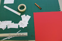
Over summer I spent alot of time on the move and didn't always have access to work digitally, which I really liked, being away from the computer gave me a chance to produce some of the more personal work I've been thinking about all year, Drawing things I've wanted to draw for a long time and experimenting with media I've always wanted to practice with. This is not just one of my aims and ambitions for third year but something I think I would like to continue for the majority of my life, but a page in a sketchbook a day is a really good creative release of ideas for myself, with the ability to easily notice progression from page to page. I think this task is easily achievable and something I want to consistently be doing. One of my other aims and ambitions for third year is to be really experimental in my choice of deliverable, thinking and outside of the box when it comes to final outcomes and working with unusual surfaces as a form of communication. As an example, over the summer I tried painting on the blades of some knives (I'm not a psychopath I swear) This is just another example of some of the hand rendered personal creative projects I've been up to over the break even if they are a little strange. As you can see in the Photo Below I also completed a painting on a piece of wood, using masking tape sandpaper and spray paint, looking at Aztec patterns and contrasting colour palettes, Although a little 'fine-arty' this has definitely given me a starting point for ideas working with patterns digitally.
Over summer I spent alot of time on the move and didn't always have access to work digitally, which I really liked, being away from the computer gave me a chance to produce some of the more personal work I've been thinking about all year, Drawing things I've wanted to draw for a long time and experimenting with media I've always wanted to practice with. This is not just one of my aims and ambitions for third year but something I think I would like to continue for the majority of my life, but a page in a sketchbook a day is a really good creative release of ideas for myself, with the ability to easily notice progression from page to page. I think this task is easily achievable and something I want to consistently be doing. One of my other aims and ambitions for third year is to be really experimental in my choice of deliverable, thinking and outside of the box when it comes to final outcomes and working with unusual surfaces as a form of communication. As an example, over the summer I tried painting on the blades of some knives (I'm not a psychopath I swear) This is just another example of some of the hand rendered personal creative projects I've been up to over the break even if they are a little strange. As you can see in the Photo Below I also completed a painting on a piece of wood, using masking tape sandpaper and spray paint, looking at Aztec patterns and contrasting colour palettes, Although a little 'fine-arty' this has definitely given me a starting point for ideas working with patterns digitally.

Digital Illustration/Drawing
This Summer, I was lucky enough to receive a Graphic Tablet for my Birthday. Last year I used a Basic Medion standard drawing pad but upgrading to the bamboo has been fantastic, It's opened up my eyes to drawing digitally in comparison to some of the stuff I was producing Last year. I really feel I've started to grasp a significant style and approach in my illustrations, using quite rough sketchy lines and areas of pointillism. I was inspired by Vice Magazines Dog show video and produced the drawings below, playing around with quite psychedelic and unusual subject matter.
This Summer, I was lucky enough to receive a Graphic Tablet for my Birthday. Last year I used a Basic Medion standard drawing pad but upgrading to the bamboo has been fantastic, It's opened up my eyes to drawing digitally in comparison to some of the stuff I was producing Last year. I really feel I've started to grasp a significant style and approach in my illustrations, using quite rough sketchy lines and areas of pointillism. I was inspired by Vice Magazines Dog show video and produced the drawings below, playing around with quite psychedelic and unusual subject matter.

Wednesday, 22 August 2012
Bramhope Primary School Mural
During the break over summer, I practiced my can control and spray painting techniques by taking part in a collaborative Mural. Me and a friend from Art and Design Interdisciplinary have a friend who's parents work closely with Bramhope Primary School just outside of Leeds. Unfortunelty the side of their building was defaced with some tags and they wanted someone to Cover the area, I thought this would be an ideal project to keep myself productive in terms of being creative and working with a deliverable other to print and web
I tried to treat this opportunity alike to that of a live brief, thinking about my audience context, content and time-frame.
Below are a few of our initial brainstormed Ideas and considerations and a few sketches to start to get subject matter flowing. Our main concern is our audience, being Primary school children so subject matter is going to need to be appropriate for their age group. We want to use some themes that the children can relate to, they have a conservation area and small allotment so fruit and vegetables, plants tree's and nature is going to be our first port of call.


The space we've been given to work with is a rather awkward area and stretches around a corner, also there a drainpipe that sits in the corner of the two walls so this is going to be a big consideration, we want the painting to interact with its surrounding environment so we're thinking incorporating the drainpipe could be very interesting.
So far our plans are to create a series of rolling hills, using the drainpipe as the basis for a tree trunk, then separating out each wall with a fading light to dark sky. Ideas for characters so far are Owl's, Birds and Bee's intertwined with foliage and vegetables in the foreground.
Our budget on Paint was something that would also have to be very well planned as certain shades would be used more than another and certain colours we would need more of. I got a selection of different greens as they would be heavily used in the foreground mixing brands of paint to try and get a really unique palette.


We started by brushing off all the dry brick and cobwebs from the wall then using multiple coats of paint we created a thick layer of white to work on top of.


Work In progress
Below is a series of photographs of the wall at different stages. We estimated to complete the painting over a frame of 5-6 days but due to typical British weather conditions it took us a little Longer, but after 10 days we were able to walk away satisfied.


Final ResultI was really happy to the conclusion we came to with our mural even thought If I did it again there would be a few things I'd change, in terms of layout etc, But i guess that's just me trying to be a perfectionist. In September when the children start back at the Primary School we hope to go and do some mini interviews to see what they think of the work. I think this will provide a really neutral and naive point of view, especially from children of such a young age.


