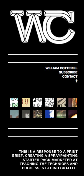
So far I've produced a series of different scamps and being playing around with different visual outcomes for my personal branding. From the sessions with Simon and Lorraine and some help from books in the library I've gained a basic knowledge in HTML and CSS, below I've started to put together a basic idea for my website, sticking to the same theme as my blog and tumblr so they are all consistent.
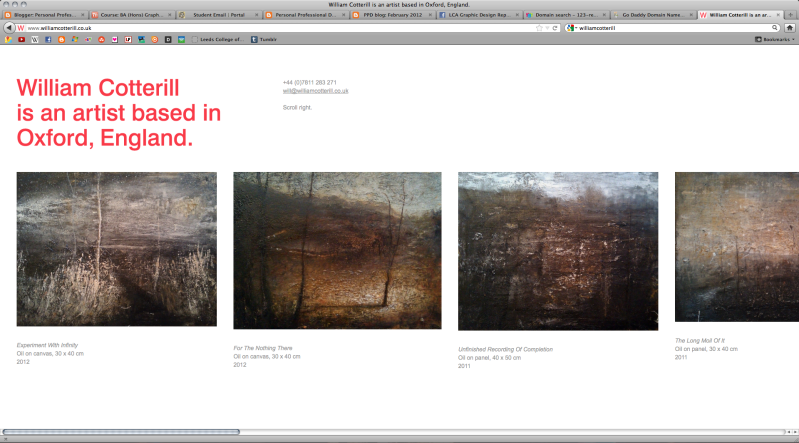
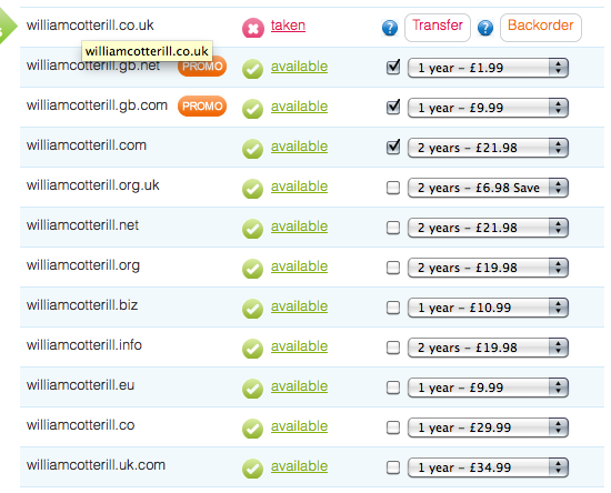
The username williamcotterill.co.uk has been taken already by an artist in Oxford who shares the same name as me, coincidentally I think his website is very visually appealing, simplistic, and works very well for a horizontal scroll. However as that was my ideal web address I'll have to search for another. Below are a few quotes I've got for different usernames so far...
The username williamcotterill.co.uk has been taken already by an artist in Oxford who shares the same name as me, coincidentally I think his website is very visually appealing, simplistic, and works very well for a horizontal scroll. However as that was my ideal web address I'll have to search for another. Below are a few quotes I've got for different usernames so far...
A few different colourways....
Even though I want to keep as consistent as possible to my tumblr and blogger, Experimenting with colour has been really productive in generating more ideas for my website. I Think it would be nice to have the same layout for each one of my networking options but each one to have a different colour theme/gradient.
I tried to keep the links and buttons as user friendly as possible and easy to understand, on the right hand side my content will be displayed and on the left links to subscribe and contact + a small blurb about the work you're viewing. I thought the grid of small thumbnails immediately communicates that they have some sort of function so no need for an explanation cluttering up the rest of the page.
I felt as if there was no need for a scroll or a bar either side of the page but instead just two small arrows that could be easily recognizable as moveable buttons. The content displayed on the right hand side of the page will be navigated by simply clicking the small arrowhead at the top of the page or the small arrowhead at the bottom.
When a new project/brief is selected from the archive of thumbnails on the right hand side the content below underneath the separator will change accordingly to the content displayed on the right hand side of the page.


No comments:
Post a Comment